Overview
Purpose
We are here to help to create the experience of a life time. Giving families the best and safest rafting experience in the industry. Dry Oar goes above and beyond in safety as well as in entertainment. We want to create something that families and the people within them will remember forever. We have all had those times in our lives that we tell everyone we know about. We do so because they made a lasting impression on us. We strive to be that lasting memory as a company.
Audience
Our audience are families. Families that are upper middle class, and who have extra money to spend on non essential services. They most likely take trips very frequently, vacationing in foreign countries and staying at nice resorts. We want to give them the same expereince of that. The people that will be coming here are those who want to be care free on their vacations and trips. They want others to plan everything, having a package deal that takes care of: food, transportation, entertainment, and sleeping arangments.
Branding
Website Logo

Style Guide
Color Palette
Palette URL: https://coolors.co/404363-c3cad5-edf2f4-f68d99-b40421
| Primary | Secondary | Accent 1 | Accent 2 |
|---|---|---|---|
| #404363 | #C3CAD5 | #EDF2F4 |
Typography
Heading Font: Raleway
This is our heading font because it is crisp and simple, but when adjusted slighty, certain letters have a litte more flare.
Paragraph Font: Crimson Text
This font is more classic and proffessional. It will give the reader the impression that our business provides quality to match their class.
Normal paragraph example
From the resort to the rapids, quality is what you will find and experience. Since 1983, we have been crafting the perfect outdoor vacation for our valued Members.
Colored paragraph example
Trips vary from mild and great for families, to trips exclusively for physically fit and experienced rafters. No matter what type of river adventures you are seeking, White Water Rafting Company can make it happen for you.
Navigation
Site Map
The Site Map of a site is just like it sounds…it is a map of the pages in a site and how they are related and linked together. From the map above we can see that we will eventually have the Home page and 2 sub or child pages.
The lines that connect them all together indicate that each page should be accessible from any other page, it is essentially showing us the global navigation for the site.
Wireframes
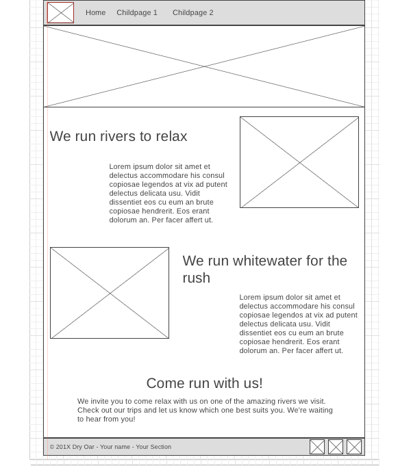
Wireframes are like blueprints for making webpages. They should show the major sections of content that will be on the page and the relative locations of each element. In the wireframe below you can see there will be 6 sections to our page:
- At the top we have a section with the logo (the box with the mountain means an image) and the navigation bar.
- Then there is a banner image that stretches all the way across the screen.
- Next we have some text and an image
- ...followed by another row made up of an image and some text.
- Then one more section of text with no image.
- Lastly, a footer containing a copyright/name line and 3 social media icons.